One of the great parts about living in New York City is that there is a ton of really fantastic architecture around. I tend to find myself among those that love the more classic architecture of the earlier part of the 20th century. Most modern day skyscrapers made of mostly glass I feel are less beautiful and do nothing to really enhance the skyline (this includes the new Bank of America Building, Trump Tower, or even the new New York Times building I'm not such a fan of).
I like buildings with stone or marble - I think you can do a lot more design-wise with these elements. You can create things that flat glass and metal cannot. There are so many great buildings in this city. Some are the really obvious ones:
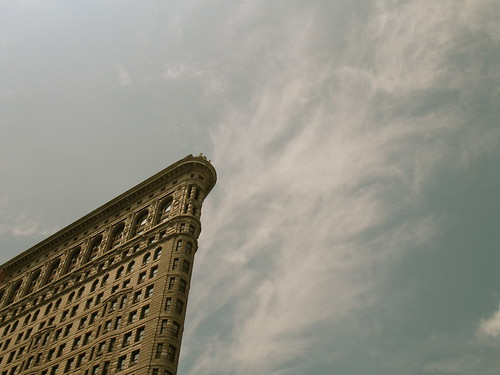
The Flat Iron Building (completed in 1902)
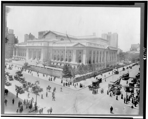
The New York Public Library Main Branch (Completed in 1911) *This photo is obviously not taken by me, but is available on Wikimedia Commons.
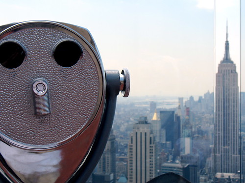
The Empire State Building (completed in 1931)
These buildings all have substance to them, and it feels like they have a timeless, classic design, and are sturdy to withstand time. Maybe it's also they sense of history that they carry. It seems like all of the glass towers just reflect what is around them, while the older ones can stand beautifully on their own - rather than reflecting the world around them, they contribute style and substance to the world.
Some of the buildings have such great details:
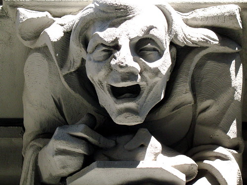
527 West 110th Street (this photo by me, but there are some other nice photos at the link).
and also:
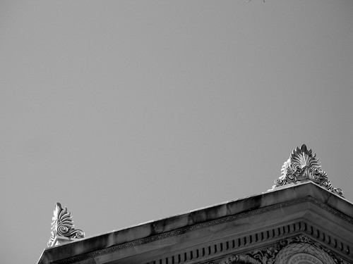
Beautiful detail of a building on Central Park West
These are the kind of details that you cannot see in a building like the glass towers described above, and that are so popular now. I wonder how, 50 years from now people will appreciate the glass versus the intricate details above.
The thing that inspired the post today was a brief mention on the New York times website about how the economic times effect architecture. The article: Urban Un-Planning - Form Follows Finance described how the financial climate of the times influences the landscape.
What caught my interest is the part about the Hearst Building. Here is a building that has at it's base - beautiful stone scuplture, and above a really well done, modern glass tower.
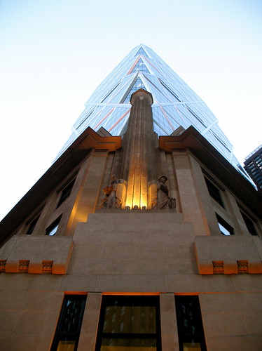
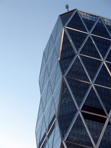
Norman Foster who did the design on the modern portion of the tower, and I think he did a wonderful job of creating an appealing design, it looks more like a sculpture and compliments the intricacies of the base architecture. It is one of the few newer buildings that I enjoy...
+4-09.jpg)

No comments:
Post a Comment